


These are 100-Day Challenge Mentors.
They did some work before you received the Challenge Note. This included:
- Writing the Challenge Note, and making sure that the leaders of all the organisations represented on the team are comfortable with it – and committed to supporting the work of the team
- Helping the leaders of these organisation recruit you and your colleagues to the team
- Gathering some baseline data and other information that will help you and your teammates set your 100-Day goal and develop your plan.
- Making sure all the preparations are made for a successful Lift-Off workshop, when you and your teammates will meet and get your 100-Day Challenge started. This includes venue, facilitation support, food, swags, comms, travel arrangements and whatever else is needed.

Mentors will participate in all or part of the Lift-Off Workshop, mostly at the start to provide context and answer questions, and at the end to give you and your teammates feedback about the goal and plan you develop.

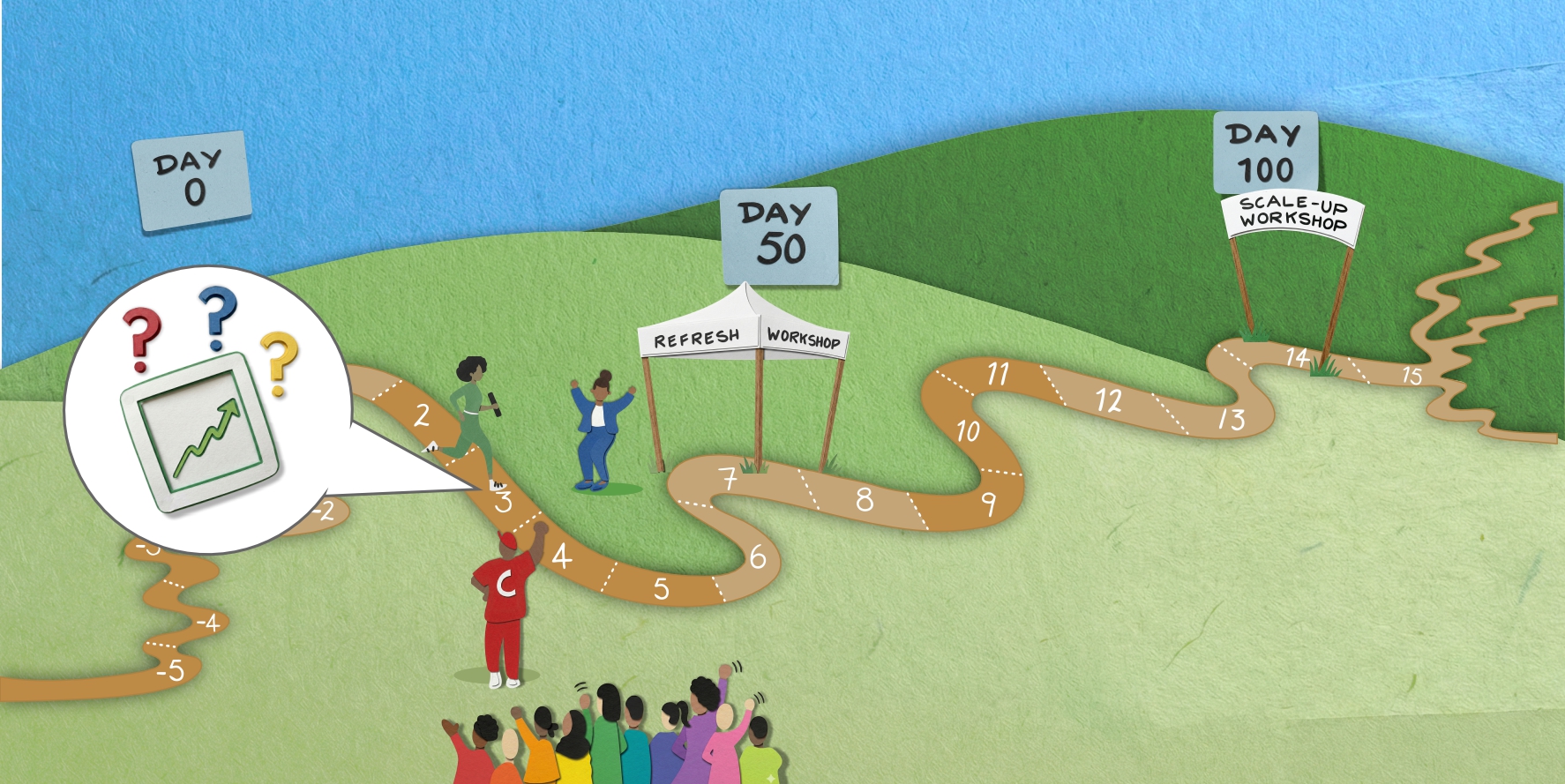
During the 100 days following the Lift-Off Workshop, here’s what the Mentors will do:
- They will check in every two weeks with the team leaders to see how the team is doing and what support they and the team need.
- They will keep other organisational leaders informed and engaged during the 100 days, and pull them in to help as needed.
- They will participate in the last part of the Refuelling Workshop, halfway through the 100 days, to see what additional support the team needs, and to begin to plan with the team for sustainability and scale-up.
- They will work with the team at the Sustainability Workshop to finalise recommendations on sustaining the results and building on the work of the team.